Tuesday, 6 September 2011

Attractions ( Using Dreaweaver) (iii)


Finally, the last step is to link all the web pages together.


First of all, i want to link the four main buttons in my first individual webpage to the other links.


Firstly,  click on the image that i want it to link to the other page


Go to'' Link''  that shows in properties, then click on the yellow folder and choose the webpage i want 


Now, i want to link the text in my content to other webpage by using Hyperlink


Highlight the text, and click on the top right icon( Hyperlink)


Choose the webpage that i want to link by clicking on the yellow folder

Lastly, i would like to have a email link on my webpage


Highlight the email address


Click on the Email Link icon

Paste/Type the email address in the E-Mail box

Up to here, my individual link for assignment 3 is successfully completed =]

Attractions ( Using Dreaweaver) (ii)

From the previous post, i have showed the progress on the making of main buttons for my webpage.
So this is the outcomes i got.


These are the first image and second image used to insert rollover image. To insert this in Dreamweaver, first i have created a table with 2 rows and 2 columns for four buttons.Now i would like insert the first button by clicking on Insert > Image Object > Image Rollover


Browse the original image and rollover image from the respective folder


Repeat the same methods to the other 3 buttons and this will be the outcome

After this, i have to create another 5 web pages to link them with the main buttons. I named them as "diving html", "snorkeling html", "fishing html" ,"turtle html" and "more html".

Now i would like to show the making of ''diving html''. 
Open a new html file with blank page and <None> layout. Then put in the contents that i prepared. After that insert the pictures which have been edited in Photoshop. And also, i used the same methods for the making of  the remaining 4 web pages.


   Created a table with 1 row and 3 columns and then
Insert each of the picture to the column.

Original image
Edit in Photoshop
Layer style> Stroke: size 3px
This is the outcome


To standardize the images in my individual link, i edited all the image by adding stroke of size 3 and re-sized them ( width 300, height 250 ) when insert into Dreaweaver. 


So this is the outcome (open in google chrome)

P/S: Applied the steps and methods to the other 4 links =]


Assignment3-Pulau Kapas -Attractions ( Using Dreaweaver) (i)


After the initial layout and design of my individual webpage, now i'm going to start my individual link in assignment 3 by using Dreamweaver.

Firstly, i opened a new html file and chose blank page with <none> layout.


Now i would like to insert the banner, logo, buttons, and background of my group to the table that i already inserted and saved the file as a template for my webpage. You can go to insert > image> look in to insert image


This is how it looks like when we open it with google chrome


Based on my initial design, there are four main buttons in the first page of my individual link. Therefore, now i have to create them by using Photoshop. To make the rollover effects of the buttons, so i needed to have 8 photos which have been edited.  


The pictures below show how i did for the first button ( Underwater diving)
p/s: the other 3 buttons using the same methods as well

This is the original image that i used it as my first button
After adjustment of brightness 40,contrast 30
Filter > Paint daubs: Brush size 8, sharpness 7
Layer style: inner glow: size 20 , opacity 75
Now i would like to insert text to the photo by using the
 horizontal type tool


with Layer style> Drop shadow: size 5, distance 5
> Outer glow: spread 20, size 13
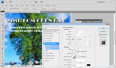
Go to layer style> Bevel and Emboss: size 30px

Friday, 19 August 2011

Assignment 3 - Pulau Kapas


Description on the individual link (Attractions)
The creation of this individual link is to introduce the attractions of Pulau Kapas to viewers. Real pictures of the attractions of Pulau Kapas will be presented to show how is the place and how beautiful is the island. Furthermore, the descriptions of  each attraction can let the viewers gain more information about the island.


Objective of the link
The main objectives of this link is to promote Pulau Kapas to the viewers. Thereby increase the number of local and foreign tourists to the island. And also, to let the people know that there is a beautiful island in Malaysia so that people can spend their holidays and enjoy in Pulau Kapas.


Design of GUI


This is the initial layout of my group website. There will be a banner for the site and below are the links for the particular sub topic. The tittle in the banner of the website is " Pulau Kapas". The subtopics are introduction, how to go, attractions , accommodation, and webmaster. Before you click for further information, there will be a slide show embed in the website to show some picture in the website to gain some attraction of the viewer and to show the general things will be presented in the website.


Flow chart and layout of the individual site- Chan Mei Wui ( Attractions)

This is the initial layout that i'm gonna use in my individual site. When the viewer clicks into my site, a flash or a video of the attractions of Pulau Kapas will be shown in the top of the left. The content will be categorized to four groups ( yellow boxes). When the viewer click into one of those, it will link to another page that shows all the information and pictures of the related content. 


This is the flow chart of my individual site. 

Photoshop will be used to edit and create the banners and pictures of the website. Dreamweaver will be used to create the website. 


Saturday, 23 July 2011

Advanced Layering

This is the final step in doing my eWallpaper. Although the final output of my eWallpaper is not perfect but i did tried my best in doing it well.  Thank you <3


Drag the tittle of my eWallpape to a new image by using move tool

Clip the tittle with the new image by pressing Alt and click between the two layers in layer window
Then choose Merge visible
Outcome of applying Advanced layering


Finally done my eWallpapaer =]

Friday, 15 July 2011

Retouching and Enhancing

This week i learnt the retouching and enhancing skills in lab. Now i would like to apply these skills to my eWallpaper :)


The original background which already hidden all the other layers.


Image > Auto Color to adjust the color of the background.

Brightness is set to -18 and Contrast remain 0.

Use the Clone Stand Tool to remove off the words on the board.


This is the result after removed all the words on the board by 
using Clone Stand Tool

Use the Horizontal Type Tool to insert word on the road sign.
Then, go to Layer > Layer Style and change the font style.


Layer Style >  Outer Glow (Opacity = 100, Spread = 50, Size = 10,
Range = 50) to create out glow effect on the words on the
road sign.


Final outcome for the sign board.

Filter > Render > Lightning Effect to create lightning effect 
on the words.


Lighting Effects( Intensity = 98, Narrow = 100, Material = 75, 
Exposure = 12, Ambience = 38) to create lightning effect
on the  road sign.


Final outcome for the lightning effect.


Final outcome for the whole retouching and enhancing part. -^^-


Layering (re-do)


Add another layer to the previous output of Selection Tool stage as background


The original background without any effect added.


Inner effect of the background after changing the Layer Style >
Inner Glow ( Opacity = 75 , Choke = 10, Size = 150 )


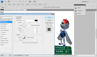
Layer Style > Drop Shadow ( Opacity = 75, Distance = 30, Spread = 5,
Size = 15 )
 to create shadow for the Ebee.

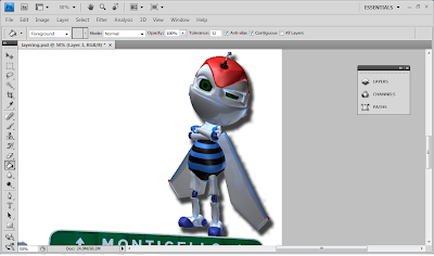
The shadow is successfully being created for the Ebee. ^^


The original road sign that are not edited yet.
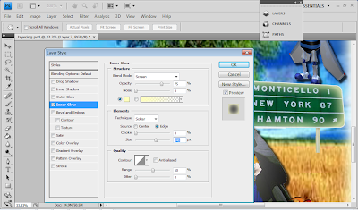
Layer Style >  Inner Glow ( Opacity = 75 , Size = 141 )  to
create a inner glow effect for the road sign. 


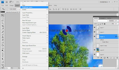
Layer > Duplicate Layer to create a shadow effect of the 
MMU logo by duplicating it.

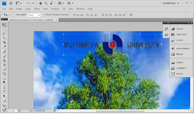
Shadow effect of the MMU logo by using duplicate layer.

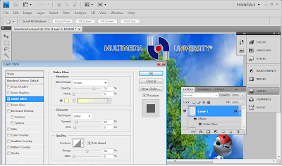
Layer Style > Outer Glow (Opacity 75, Spread 10, Size 5, Range 50) to
create a white outer glow effect for the MMU logo.


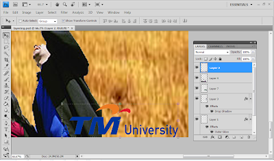
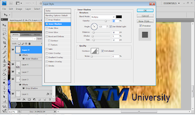
TM logo without any effect or layering added.

TM's logo after inner glow effect by changing the Layer Style >
Inner Glow (Opacity = 75 , Distance = 10, Choke = 5, Size = 12)

Layer Style > Outer Glow(Opacity = 75, Spread = 10, Size = 5, 
Range =50) to create a white outline on the TM logo.


Use the Horizontal Type Tool to insert word on the background.
Then, go to Layer > Layer Style
 and change the font style.


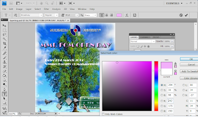
Then, go to Select Text Color to change the text's color.


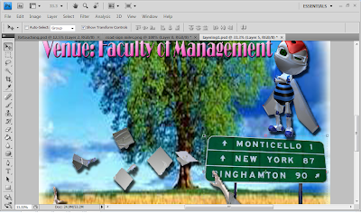
This the final outcome of the Layering stage of my eWallpaper